Kris Sieber

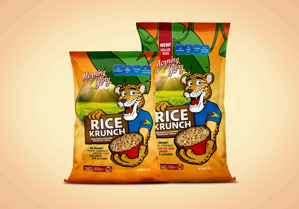
Morning Glory Rice Krunch Packaging

Packaging / Kid-approved! After countless mornings as a child spent behind table-top forts built of cereal boxes, how cool is it to design kids’ cereal packaging! In addition to the packaging design based on the original Morning Glory cereal packaging, I also illustrated the jaguar character. Home

Sak Bottle Packaging

Packaging / Sak it to me. Harnessing the health benefits of endemic purple potatoes, Sak is a unique energy drink in Guyana. The label design evokes the sun shining over the hill country where purple potatoes  are grown, infusing them with natural energy and vitality. Home

Stickling’s Bakery Branding

Branding / Freshly baked. A brand evolution project, I was tasked with modernizing the traditional Stickling’s Bakery logo with the goal of improving clarity and readability. The rough script used in the previous logo was replaced with more open and predictable letterforms, colours were brightened, a container devised for improved visibility over a variety of …

Stickling’s Bakery Branding Read More »

Kawartha Artistic Swimming Branding

Branding / Make a Splash. With a shift in naming to Kawartha Artistic Swimming, a new logo for the synchronized swimming club was in order. Designed to be dynamic and fun, with a touch of sophistication, the new brand is ready to hit the pool. Home

Morning Glory Cereal Branding

Branding / Rise and Shine. Made with the great taste of locally-grown rice, Morning Glory breakfast cereal is ready to help Guyanese start their day. Designed as part of a full packaging project for the cereal line. Home

Coffee Talks Branding

Branding / Coffee Talks. Logo designed for Coffee Talks, an series staged by Peterborough Economic Development for business and industry people to meet in a casual, over-coffee setting while engaging and learning from thought leaders. Home

Sisu Services Branding

Branding / Inner Strength. Sisu is a Finnish concept for one’s inner fortitude. Sisu services was a coaching service designed to develop resiliency and inner strength. The logo, comprised of the letters S, I, S, and U evokes both a torch — representing the fire that burns within us all — and a person with …

Sisu Services Branding Read More »

Sugar Daddy Fresh Soda Branding

Branding / Top of the Pops. A sweet project by any definition, the Sugar Daddy Fresh Soda Co. branding was undertaken as part of a greater packaging project for a series of six artisan soda syrups.  Home